Orange Paint
We needed to patch and repair the walls where curtain rods or shelves had been hung. Because the walls are painted such intense colors, that's an issue. Fortunately the former owners left us cans of paint for touch up.

Unfortunately, I don't see a can of the orange that is in the guest bedroom, and that's where a set of three heavy shelves had been mounted on the wall. When we took them down, serious spackling was needed to fill the holes, and the repairs have to be covered.

There was a can of the cinnamon - persimmon kitchen wall paint, and I thought what's to lose? I'll try touching up this similarly orange wall and see if it's even close. If not, we'll hang a big framed mirror on this wall to hide the spots. Three feet by three feet square -- that would do.
Surprisngly, although the kitchen and the guest room look like different oranges, the painted spots matched the wall.

Not so for the living area. Oddly, there are four shades of ecru / beige / taupe / cream covering different angles of the big open room. There are only subtle shade differences. I tried each one for the spots on the low fireplace-bookshelf wall but none of what I had matched the wall color at all. Fail.

With no way to hide these eye level spots with mirrors or wall art, we'll have to go to the paint store and find a chip that matches more closely.
The red accent wall in the TV room needed painting above the door where the curtain rods had been. Fortunately there was a can of red for this.

It came out just fine, matching beautifully.

The sage green bedroom needed repair and touch up too, and there was a can of paint for that. It came out looking good.
I found squash blossom orange paint for the guest bathroom, and touched up those spots over the window corners. I really should mount a valance there to cover the cheap blinds (or get nicer blinds).

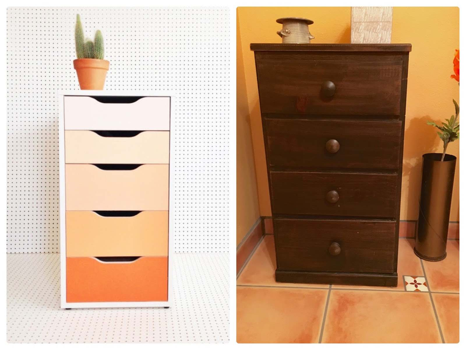
While I was thinking about the guest bath, I came across this idea for a painted cabinet. The ombre effect on each drawer would be easy to do with the small dark chest of drawers that I have now in the guest bath.
 I love the fun look, and the chest I have is an old, inexpensive one from long ago that could use freshening up and maybe some colorful knobs too. Ombre shaded drawers in cream, tan, sunset and squash blossom orange would be perfect. I might do this.
But, seriously . . . too much orange paint?

Unfortunately, I don't see a can of the orange that is in the guest bedroom, and that's where a set of three heavy shelves had been mounted on the wall. When we took them down, serious spackling was needed to fill the holes, and the repairs have to be covered.

There was a can of the cinnamon - persimmon kitchen wall paint, and I thought what's to lose? I'll try touching up this similarly orange wall and see if it's even close. If not, we'll hang a big framed mirror on this wall to hide the spots. Three feet by three feet square -- that would do.
Surprisngly, although the kitchen and the guest room look like different oranges, the painted spots matched the wall.

Not so for the living area. Oddly, there are four shades of ecru / beige / taupe / cream covering different angles of the big open room. There are only subtle shade differences. I tried each one for the spots on the low fireplace-bookshelf wall but none of what I had matched the wall color at all. Fail.

With no way to hide these eye level spots with mirrors or wall art, we'll have to go to the paint store and find a chip that matches more closely.
The red accent wall in the TV room needed painting above the door where the curtain rods had been. Fortunately there was a can of red for this.

It came out just fine, matching beautifully.

The sage green bedroom needed repair and touch up too, and there was a can of paint for that. It came out looking good.
I found squash blossom orange paint for the guest bathroom, and touched up those spots over the window corners. I really should mount a valance there to cover the cheap blinds (or get nicer blinds).

While I was thinking about the guest bath, I came across this idea for a painted cabinet. The ombre effect on each drawer would be easy to do with the small dark chest of drawers that I have now in the guest bath.
But, seriously . . . too much orange paint?
Comments