How it Looks Now
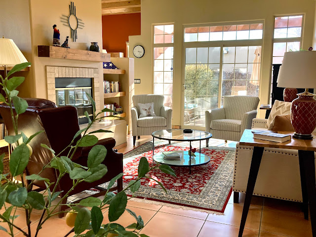
Here is how the entire living room looks now, upgraded and arranged with new furniture.
I was trying to stay away from New England formal and set a comfortable, easy look, maybe even with a sectional sofa. I wanted casual. I think decorators call it "transitional" style, between classic and modern.
I wound up with a pretty formal looking space. I don't do easy easily.
I was trying to brighten things up with ivory and neutrals. Our house is all earth tones and oranges and tans, I wanted it to be lighter and whiter.
I kept the red rug, leather recliner and black accents -- even added a new dramatic black painting -- and although the new furniture is impractically ivory, I reverted to dark and bold for everything else. I am who I am.
I was trying to arrange everything around the big fireplace, with chairs flanking it.
My flanking didn't flank.
The two matching striped chairs are now in front of the sliding glass doors to the patio. There's room to walk between them (just) and room to maneuver around the coffee table and new sofa. This works.
They would have fit in front of the fireplace hearth facing the sofa, but that left the ends of the room vacant and stranded the big red leather recliner out of the grouping. So I moved them and put the red leather chair next to the fireplace.
Sited in front of the bookcases with a floor lamp and small drinks table, the big chair makes a little library nook. Jim relaxes there. He won't go near the ivory couch with a glass in hand, and will probably never sit on the sofa in his lifetime. Instead he has his wine and listens to Rolling Stones on our Alexa dot, safe in a dark leather chair.
So I did not wind up with what I wanted, but I wound up with what I needed (sorry, Rolling Stones reference, Jim is in his chair listening as I type . . . )
In the end, when people come to visit, they won't notice the rug is too small or look at the details or marvel over the colors or wonder about furniture placement. They won't swoon over my glass painting of a deer skeleton in moonlight.
They'll remark instead on the potted lemon tree -- it's the single item in my home that consistently gets compliments.
It's plastic. I put it by the front door. Comment as you depart, everyone does.


Comments
Applause!!
Looks really, really inviting and chic.